Flexbox and Grid are CSS layout tools with unique strengths. Learn when to use each for pixel-perfect, responsive web design.
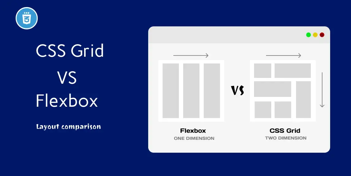
Flexbox is ideal for one-direction layouts; Grid handles both rows and columns.
Flex adapts to content size; Grid provides a structural foundation.
Navigation bars, small UI components, alignment tasks, and content reordering.
Full-page layouts, image galleries, and designs with precise placement needs.
Use Grid for structure and Flexbox inside components for fine-tuning layout.
💡 Confused between Flexbox and Grid? Discover when to use each to create responsive, elegant, and performance-optimized layouts for any screen size.
Both support responsive design, but Grid offers more control over two axes.
Conclusion
Both Flexbox and Grid are powerful tools. Choosing the right one depends on your layout needs—use Flex for simpler, linear designs, and Grid for complex, structured layouts.